Premom
Premom is a fertility app that assists women in tracking their menstrual and ovulation cycles, seeking expert advice, and sharing their pregnancy journeys. As a UI/UX designer at Premom, I oversaw app, web, and graphic design aspects.

App Modification
I served as the UI/UX designer for the existing Premom fertility app, addressing issues like the ineffective design system, low retention and conversion rates. I revamped and consulted on the UI/UX aspects of the app.

Web Design
As a UI/UX designer at Premom, I collaborated on various company websites, including the Premom-Ebook site, the official Head Counter website, and the Marketing Ambassador platform, ensuring seamless and engaging user experiences across diverse platforms.
App Modification Examples
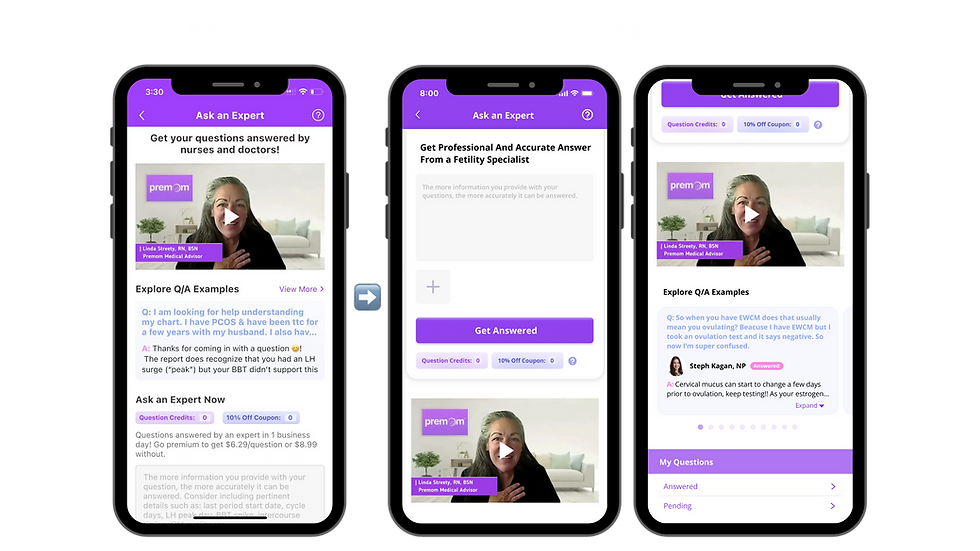
The app modification's product design objective is to boost key performance metrics such as app and membership conversion rates and the 'Ask an Expert' feature.
Use of color girds (Gestalt Principle)
Use cohesive colors to visually separate sections
Use real images of products or people to narrate what we can offer more vividly instead of using graphical icons
Add a Sense of Palyfulness
Use playful backgrounds, images, or motion designs to develop a joyful and rewarded user experience
Use Real Images


Move forward the CTA
Moved forward the question form for the users to access more easily
Removed and consolidated some similar sentences
Minimize unnecessary user actions
Enabled swipe and expand functionality for Q/A examples, eliminating the need for users to leave the page for further information
Avoid Wordiness


Adding re-edit function
Make the question re-editable to avoid having to go back and forth
Avoid the confusion of whether there could be several questions in a single submission with $7.19
Increase consumer impulse
I replaced 'Order Total' with 'Total' and 'Place Order' with 'Submit' to give users the impression that they are not 'purchasing an order' but rather 'getting their questions answered'
Avoid misleading information


Web Design
In the world of design, not every project unfolds as envisioned. Clients and companies have distinct needs, even if they aren't always reasonable. As a designer, balancing user-centric visuals with meeting the demands of clients and companies is crucial. This project taught me this valuable lesson. While this may not be my proudest design in terms of personal representation, it successfully addressed the client's specific requirements. Here is the result.

.png)


How we worked as a team
I collaborated closely with the marketing and product teams, transforming ideas discussed in online meetings into effective landing pages on the official website. By incorporating call-to-actions, I helped achieve the company's marketing goals through impactful web designs.
Meetings & Discussions
I actively collaborated with the marketing and product teams, contributing to brainstorming sessions and discussions to shape ideas and requirements for the landing pages.

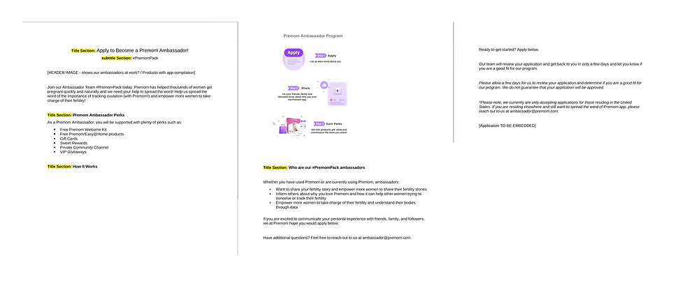
Final Content & Layout Confirmation in Documents
We translated discussions into detailed documents, ensuring alignment with branding guidelines and marketing goals, fostering clear communication within the team.
.png)
Low-Fi Design
I crafted low-fidelity design prototypes, refining them based on feedback and user experience considerations, emphasizing user-friendly and conversion-oriented designs.

Responsive Hi-Fi
App & Web Design
I implemented responsive high-fidelity web designs, incorporating effective call-to-action elements to achieve the company's marketing goals through seamless user experiences across various devices.

